Few steps to avoid mistake while interior designing
Don’t be afraid to ask for Help
Be it with color, room use, scale, or placement of furniture and fixtures. Even if you are comfortable with your own design sense, getting another opinion can give you peace of mind and help you avoid costly purchases or the repainting of rooms. Many designers work on an hourly rate and are approachable.
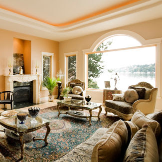
Do not over decorate a room
Less is more, People tend to over decorate their homes, filling every space with furnishings that have little sentimental value and ending up with spaces that look like a model home.
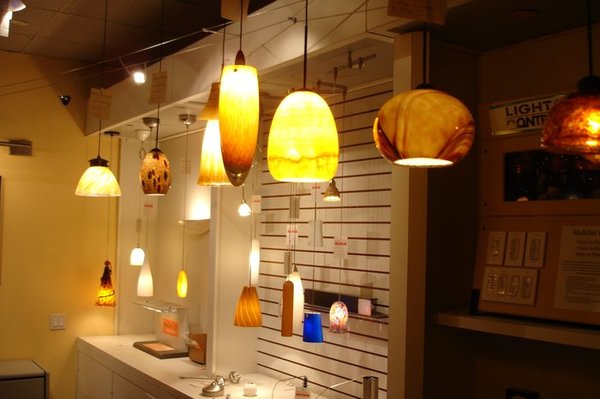
Avoid Bad lighting
A good lighting plan achieves both aesthetic and functional needs. Too many lamps in a room says lamp store. The goal is to find a perfect balance between architectural lighting (recessed, track or cove lighting), focal point lighting (chandeliers, sconces) and lamps (task lighting).
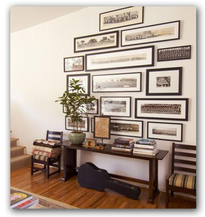
Avoid hanging art too high or scattering art
The common mistakes are hanging art too high or scattering smaller scaled artwork around a room rather than grouping them together for more impacted.
Do not pick up wall colors too quickly
People have a tendency to rush out and pick wall colors without considering all the other elements in the space. Don’t pick a paint color without considering all the other elements that will go into your space. Once you have picked a color, test it out. Paint your sample on a piece of foam core board and look at it in different locations in the room and at different times of the day. Designer’s rule of thumb: “Paint is the last thing you pick but the first you apply.”
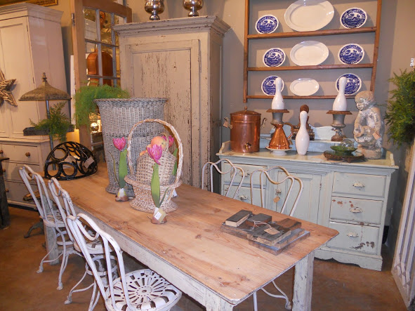
Do not overload
Collections can easily overtake and dominate a space if left unchecked. Create a specific display area for your collection. Limit the number of pieces that will be displayed. Grouping your collectibles in a specific location will show them off better than scattering them through your home.
Do not put Everything You Love in the Living Room
“Edit, edit, edit! Look at those rooms you love in your favorite magazines; I’m willing to bet editing is one magic trick that made them look so good! Count the number of objects on the coffee table, how many throw rugs are on the floor, the number of framed photos and knickknacks on mantels, tabletops and shelving. Experiment with your own space by taking a few things away. Try to group similar collections in a single spot. I’m no minimalist … but I see editing as a way to make your favorite pieces stand out and to create a space that feels supportive. Like a pair of jeans that are too small, furniture must also fit. Furniture that is too small will make your room seem unbalanced and awkward and might even make it seem more like a dollhouse – this is certainly not a look we’re after! Conversely a room whose furniture is too large will also feel unbalanced and cramped. Before you move your furniture, and certainly before you purchase new furniture – whether couches, tables, dressers or beds – be sure to measure both the furniture as well as the room, for height, width and depth. Not doing so could end up being a very costly mistake.
Avoiding these common mistakes will give your home a more cohesive feel and enhance your living experience.
Don’t be too Eager
Don’t buy too much. Don’t buy everything all at once. And don’t overspend. Buy the best that you can afford today – not what you think you will be able to afford tomorrow. Make a budget and stick to it. You don’t have to have everything all at once. A well decorated space is one that is curated over time so it’s best to go slowly and build slowly.
Never Apply Paint directly on Wall
Never apply paint samples to a wall and always order full size swatches to move easily throughout the room at different times of the day. Use two samples in corners to show the intensity of a color reflected off itself – four painted walls can look much different than one.”


